Category Archives: mathematics

Moose on the Loose!

Note: a version of this post was given by the author for Invocation at the UVM College of Engineering & Mathematical Sciences graduation ceremony, Flynn Theatre, May 18, 2014.

A few weeks ago—on one of those beautiful spring mornings that makes the long winter seem like it happened elsewhere—something quite remarkable took place here at the University of Vermont.

At the time, I was sitting outside on a small wooden picnic bench near my office on Trinity campus. The sun was shining, the birds were chirping their layered periodic rhythms, and the Green Mountains were finally living up to their name after months of radiating white.

Vermont Mountains Panorama at Sunrise Mt Ascutney, Vermont, New England, USA

I’d love to say that I was meditating within our glorious landscape. I’d really like to say that I was deeply appreciating the sacred gifts offered by Mother Nature. The truth is that I was totally geeking out.

I was reading storylabber Dilan Kiley’s undergraduate Honors thesis. It was awesome! He quantified the spread of information on Twitter in response to sudden, unanticipated events. These system-scale shocks can briefly synchronize our society’s chaotic collective attention. And while reading about them in Dilan’s thesis, I experienced one myself.

I heard a strange noise nearby, and looked up to find a moose staring at me, from 10 feet away. Well played Dilan.

The moose was out of breath, having been chased up the hill from the lake by an excited mob of followers. In a moment that seemed to last several seconds, we looked at each other. I was in awe. The moose looked unsure, confused, and lost.

Our time together was quickly interrupted by animal control officers. They were sprinting after the moose, trying to steer it safely into the woods. A small flock of undergraduates followed, looking at each other in disbelief at what they were seeing.

Not surprisingly, a seven foot tall, thousand pound wild animal jogging through campus caused quite a stir! Pictures of the moose received thousands of likes on social media, and #mooseontheloose started trending, at least here in Vermont. After a few hours in the spotlight, Vermont Fish & Wildlife happily reported that the moose found its way back into the woods north of campus.

I tell you this story today because I think the moose’s adventure offers some lessons for us as you wander off campus to find your way home.

In the past few weeks, I’ve spoken to many of you, asking about your plans for the future. This is a time of great transition in your life. Most of you don’t have a grand plan, or even a muddy pond to call home.

Like the moose, you too may feel a bit lost. You too will have many people taking your picture, and making a big fuss over you. 

Over the coming months, you too will have well-intentioned loved ones trying to steer you to a safe path in life, advising you where to go, and what to do. You too will have to find your way through a noisy, often confusing set of uncertain options.

As people, we imitate role models whom we admire, using their past choices to inform our own. As scientists, we use mathematical models to make predictions, which are helpful, because unfortunately, observations of the future are not available at this time [1].

Seemingly inconsequential decisions, that you make, may change your life in the biggest ways. But which decisions are most important? To which decisions will your life be sensitively dependent?

I reached out to the hero of our story via his parody Twitter account @BTVMoose. Really. Talk about geeking out. I asked for words of wisdom for the class of 2014. Overcoming the great modern difficulty of finding a wireless internet signal in the dense forest, he was able to tweet this advice:

To paraphrase this bit of spiritual guidance: you may need to wander around a bit, before you find your way.

[1] Original quote from Knutson and Tuleya, Journal of Climate, 2005.


Leave a comment

Filed under geohappiness, mathematics, prediction, social phenomena

Now Published: The Geography of Happiness

Today we’re pleased to announce that our article “The Geography of Happiness: Connecting Twitter sentiment and expression, demographics, and objective characteristics of place” has been officially published by PLoS ONE.  We wanted to tell you about one key piece we’ve added to the paper and an unusual new Twitter account we’ve created.

After our three blog posts (which coincided with the release of the preprint), we received plenty of media attention, as well as some fantastic feedback from readers (thanks!). One very important question kept coming up: “How well does happiness agree with other measures of well-being?”, or more simply: “Why should we believe you?”

Well, we’re glad you asked.  For the final paper, we’ve added a US state-level comparison between our happiness measure and five other kinds of well-being indices:

  • the Behavioral Risk Factor Surveillance Survey (BRFSS)  for which people were asked to rate their life satisfaction on a scale of 1 to 4 (the BRFSS was explored in this Science paper on well-being from a few years back);
  • Gallup’s health survey-based well-being index;
  • the Peace Index, which aggregates various crime data;
  • the America’s Health Ranking, which aggregates health data; and
  • gun violence, specifically the number of shootings per 100,000 people.

In the figure below, we show a series of scatter plots comparing all pairs of well-being metrics  (happiness runs along the top row).  Each dot represents a US state, and the colors represent strength of correlation or agreement between measures, with blue meaning strong agreement, and red representing no (statistically significant) agreement. (We include the exact Spearman correlation coefficienr and p-value in each scatter plot.)

happinessScatterMatrix1

Scatter matrix showing comparison between different well-being metrics for all US states. The top row shows comparisons with happiness. Colors indicate the strength of correlation between pairs of metrics; shades of blue indicate increasingly significant correlation.

Looking at the top row, we can immediately see that happiness agrees with all measures except for the BRFSS. However, the BRFSS itself doesn’t agree with any other measure except for the Gallup well-being index.  The most striking departure was the BRFSS ranking Louisiana as the happiest state whereas our happiness measure placed it last.  There are a number of possible explanations for these disagreements: one is that the BRFSS data was taken between 2005 and 2008, while all other data is from 2011 only; another is that unlike the other measures, happiness is self-reported in the BRFSS. How would you answer if asked how happy you are? Do you expect that your answer is representative of the population you live in at large? There are certainly many different ways to define “happiness”, as a number of different readers have pointed out.

Of course, this is not to criticize the BRFSS (it remains a significant data source, and Oswald & Wu did fine work analyzing it in their Science paper), but merely to suggest that our word happiness score is measuring something different but perhaps complementary to traditional survey-based techniques. There certainly appears to be plenty of value to observing people “in the wild” via social network data, e.g. with the real-time instrument hedonometer.org.

Finally, to celebrate the publication of our article we created a Twitter feed, @geographyofhapp, dedicated to tweeting the happiest and saddest city every day, and we invite you to follow.  We’re hoping that this is the first research article with its own Twitter account, but perhaps not hoping that it represents the future of scientific publishing…

Leave a comment

Filed under geohappiness, mathematics, psychology, social phenomena

Chaos in an Atmosphere Hanging on a Wall

This month marks the 50th anniversary of the 1963 publication of Ed Lorenz’s groundbreaking paper, Deterministic Nonperiodic Flow, by the Journal of Atmospheric Science. This seminal work, now cited more than 11,000 times, inspired a generation of mathematicians and physicists to bravely relax their linear assumptions about reality, and embrace the nonlinearity governing our complex world. Quoting from the abstract of his paper:

`A simple system representing cellular convection is solved numerically. All of the solutions are found to be unstable, and almost all of them are nonperiodic.’

While many scientists had observed and characterized nonlinear behavior before, Lorenz was the first to simulate this remarkable phenomenon in a simple set of differential equations using a computer. He went on to demonstrate the limit of predictability of the atmosphere to be roughly 2 weeks, the time it takes for two virtually indistinguishable weather patterns to become completely different. No matter how accurate our satellite measurements get, no matter how fast our computers become, we will never be able to predict the likelihood of rain beyond 14 days. This phenomenon became known as the butterfly effect, popularized in James Gleick’s book Chaos.

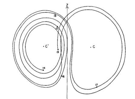
lorenz-sketch

Lorenz’s sketch of the attractor for his system.

Inspired by the work of Lorenz and colleagues, in our lab at the University of Vermont we’re using Computational Fluid Dynamics (CFD) simulations to understand the flow behaviors observed in a physical experiment. It’s a testbed for developing mathematical techniques to improve the predictions made by weather and climate models. Here you’ll find a brief video describing the experiment analogous to the model developed by Lorenz:

And below you’ll find a CFD simulation of the dynamics observed in the experiment:

What is most remarkable about Lorenz’s 1963 model is its relevance to the state-of-the-art in weather prediction today, despite the enormous advances that have been made in theoretical, observational, and computational studies of the Earth’s atmosphere. Every PhD student working in the field of weather prediction cuts their teeth testing data assimilation schemes on simple models proposed by Lorenz, his influence is incalculable.

In 2005, while I was a PhD student in Applied Mathematics at the University of Maryland, the legendary Lorenz visited my advisor Eugenia Kalnay in her office in the Department of Atmospheric & Oceanic Science. At some point during his stay, he penned the following on a piece of paper:

Chaos: When the present determines the future, but the approximate present does not approximately determine the future.’

Even near the end of his career, Lorenz was still searching for the essence of nonlinearity, seeking to describe this incredibly complicated phenomenon in the simplest of terms.

_______________________________________________________________

*Note: this post also appeared as part of the Mathematics of Planet Earth 2013 daily blog.

Taming Atmospheric Chaos with Big Data, a talk I gave at the 2011 UVM TEDx Conference Big Data, Big Stories:

Leave a comment

Filed under mathematics, physics, prediction

The Twitter Diet

How does food (or talking about food online) relate to how happy you are? This is part 3 of our series on the Geography of Happiness. Previously we’ve looked at how happiness varies across the United States (as measured from word frequencies in geotagged tweets), and then at how different socioeconomic factors relate to variations in happiness. Now we focus in on one particular important health factor that might influence happiness, obesity.

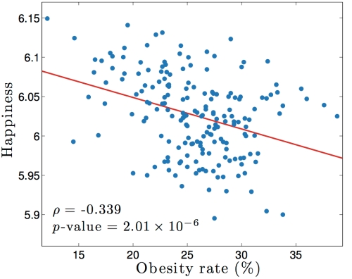
We looked at how happiness varied with obesity across the 190 largest metropolitan statistical areas in the United States, giving us the following scatter plot:

happinessObesity

Each point represents one city; for example the city with both(!) lowest obesity and greatest happiness in this set is Boulder, CO, located at the top left. The red line is a linear trend through the data (a line of best fit). Again, for the mathematically minded onehappybird watchers, we show the Spearman correlation coefficient and its corresponding p-value at the lower left. We do this to convince you that there is, in fact, a statistically significant downward trend in the blob of points in the picture! The big story here is of course that as obesity goes up, happiness goes down.

The natural next question to ask is: are there any words which could be indicators of obesity? What foods are people in obese cities eating, or talking about? To answer this question we correlated word frequencies with obesity, and searched for the most strongly-correlating food-related words. Below are two examples: on the left, “mcdonalds”, and on the right, “cafe”.

cafeMcDonalds

As obesity goes up, so does talk (at least on Twitter) about McDonalds, but talk about cafes follows the opposite trend! Does that mean that in order to lose weight we should spend more time sipping lattes in cafes? I wish.

Looking through the list of words, the top 5 food-related words that increase in frequency as obesity went up were:

  1. mcdonalds
  2. eat
  3. wings
  4. hungry
  5. heartburn

We were surprised by ‘hungry’! On the other hand, the top food-related words which were used more as obesity went down were:

  1. cafe
  2. sushi
  3. brewery
  4. restaurant
  5. bar

Perhaps unsurprisingly, these are words typically used by the high-socioeconomic group described in our previous post on city happiness, suggesting that better health correlates with higher socioeconomic status. You can find the complete list of how all words correlate with happiness here (page best viewed using Google Chrome). One surprising result was the observation that far more food-related words appeared in the low-obesity group than in the high-obesity group; in other words, food was being talked about more in the less-obese cities!

Summarizing: based on word usage, the Twitter diet consists of: breakfast at your favorite cafe, a delicious sushi lunch, dinner out at a fancy restaurant, with a nightcap at the best local bar or brewery. Thank you Twitter, don’t mind if I do.

All jokes aside, this sort of technique has great potential. Imagine being able to predict whether obesity was going to rise or fall in a city, or estimate changes in other demographics, just by analyzing the words people use online. Perhaps New York City Mayor Michael Bloomberg would find some early indicators of the success or failure of his war on soda!

And that’s all for this series of posts on the geography of happiness. More information on all of the results in this series can be found in our recently submitted arxiv paper. Please take a look at it and the accompanying online appendices, where you can look through all of the data yourself. As a special bonus feature, you can check out this video of me talking about this work at our recent TEDxUVM conference.  Thanks for reading!

4 Comments

Filed under mathematics, psychology, social phenomena

What makes a city happy?

Welcome back, onehappybird watchers! Wow, what a crazy week of coverage of our post about how happiness varies by city and state across the United States. Many, many people read, shared, and commented on the post, for which we are grateful. For the detailed explanation of the results, check out the full paper we recently submitted to PLoS ONE.

A number of readers wondered how variations in happiness relate to different underlying social and economic factors. To try to answer this question, we took data from the 2011 census (all helpfully available online on the Census Bureau’s American FactFinder website) and correlated it with our measure of happiness. Surprisingly, happiness generally decreases with the number of tweets per capita in a city (this doesn’t mean that tweeting more will make you less happy, it’s only a correlation):

happinessTweetsPerCapita

Next, we grouped covarying demographic characteristics obtained from the census, and looked at how these clusters varied with happiness. For example, it might not surprise you that cities with a larger percentage of married couples also contain a larger percentage of children – this is what we mean by covarying demographics.  And you might or might not be surprised that more marriage is positively correlated with happiness.  There’s plenty of scatter but the connection is there:

Scatter plot of happiness vs. percentage of population married. Each dot represents one city, the rho and p-values reported are Spearman correlations.

Scatter plot of happiness vs. percentage of population married. Each dot represents one city, the rho and p-values reported are Spearman correlations.

We used an automated algorithm to bin the census data for us into eight groups and then compared the happiness of those groups, leading to the following figure:

demographic_groupings_sort_blog

Each point represents a characteristic from the census (for example, the % married/happiness plot above is now represented by one point in this figure), with the horizontal groupings representing covarying demographic characteristics. A point’s position on the vertical axis shows how that characteristic varies with happiness across all cities. A positive value means that happiness is higher in cities where that characteristic is higher, while a negative value means that happiness is lower in cities where that characteristic is higher. For example, the figure shows that as the percentage of married couples in a city increases, so does the average happiness of that city (no causality is implied).

Only two groupings (the colored dots on the far left and right) showed strong correlation (either positive or negative) with happiness. Looking at which characteristics make up these groups, it appears that the general story here is a socioeconomic one, and one that holds only at the extremes. With our peculiar Twitter-based lens, we see money statistically correlates with happiness, which is not quite as catchy as “money buys happiness” (see the debate over the Easterlin Paradox for more). You can delve into the data yourself – the correlations of all 432 characteristics of cities recorded by the census with happiness can be found here (page best viewed using Google Chrome).

A more interesting question might be how word usage varies with different demographics – to do this we correlated each word with each demographic characteristic across all 373 cities in our dataset, leading to a lot of data to sift through! (And you can too, by following the link in the above paragraph.) As an example, take a look at how the word “cafe” varies with the percentage of population with a college degree:

cafe_bachelors_correlation

Each point in the figure represents one city, and broadly the trend is that the more “college-y” the city is, the more people talk about cafes online. (You can decide for yourself whether that’s surprising or not). The top 10 emotive words whose usage went up as percentage of population with a college degree went up turned out to be:

  1. cafe
  2. pub
  3. software
  4. yoga
  5. grill
  6. development
  7. emails
  8. wine
  9. art
  10. library

And the emotive words which went up as college degrees went down?

  1. me
  2. love
  3. my
  4. like
  5. hate
  6. tired
  7. sleep
  8. stupid
  9. bored
  10. you

We saw similar patterns of word use across many socioeconomic characteristics – emotive words and words about interpersonal relationships (‘me’ and ‘you’) at one end of the spectrum, and words about more complex social or intellectual themes at the other. Interestingly, we find more food-related words in this group as well.

Of course, all of this is open to interpretation. As many commenters last week pointed out, Twitter users (indeed, specifically those users who geotag their tweets using a mobile device) are a small, non-representative sample of the global population. Furthermore, our method is undeniably crude, and by breaking texts up into their constituent words ignores the context in which those words were used. That said, many of these results agree with our intuition (for example, many of the cities with low happiness scores also appeared on a list of America’s “most miserable cities” published late last week by Forbes), while some surprise us. There is certainly a lot to be learned by looking at what the data can tell us, and we encourage you to do so by exploring our website of supplementary data. Again, you can read the full technical details in our research paper here.

We’ll pick up on the theme of food again in our next post, which will focus on one important health factor relating to happiness – obesity.

9 Comments

Filed under mathematics, psychology, social phenomena

Where is the happiest city in the USA?

(Update: this work is now published at PLoS ONE)

Is Disneyland really the happiest place on Earth?* How happy is the city you live in? We have already seen how the hedonometer can be used to find the happiest street corner in New York City, now it’s time to let it loose on the entire United States.

We plotted over 10 million geotagged tweets from 2011 (all our results are in this paper, also on the arxiv), coloring each point by the average happiness of nearby words (detail on how we calculate happiness can be found in this article published in PLoS ONE):

Image

As well as cities and the roads between them, we can make out many regions of higher and lower happiness, even within individual cities. As an example, check out this tweet-generated map of the city of Chicago:

Tweet-generated map of Chicago. Click to enlarge.

Tweet-generated map of Chicago. Click to enlarge.

Notice the striking contrast between the relatively happy Central/North Side of the city, and the sadder South Side. You can also find a few airports in this map, and if you look very closely you might even be able to pick out happy and sad terminals!

To quantify this variation in happiness a bit better, let’s look at the average happiness of each state:

Image

Southern states tend to produce sadder words than those in northern New England or out west. Hawaii emerges as the happiest state and Louisiana as the saddest, due to relative differences in the frequencies of happy and sad words used in each state. Here at onehappybird, we characterize such differences by “word shifts”, which are basically word clouds for grown-ups. You can find examples of these, as well as the full list of the average happiness of each state, here (page best viewed using Google Chrome).

Zooming in further to the level of cities, we produced a similar list for 373 cities in the lower 48 states (you can find the full list, as well as maps and word shifts for each city, here). With a score of 6.25, we found the happiest city to be Napa, CA, due to a relative abundance of such happy words as “restaurant”, “wine”, and even “cheers”, along with a lack of profanity.

wordshiftNapaRedacted

At the other end of the spectrum, we found the saddest city to be Beaumont, TX, with a score of 5.82. In general, cities in the south tended to be less happy than those in the north, with a major contributing factor being the relative abundance of profanity used in those cities.

We can go even further than this, and group cities by similarities in word usage. Each square in the heatmap below represents the similarity (Spearman correlation for you mathematically minded onehappybird watchers) between word distributions for the largest cities in the US. Red squares mean that the corresponding cities use words in a similar fashion, while blue means that those cities tend to use different types of words with respect to each other. The colors in the tree diagram at the top signify clusters of cities exhibiting similar word usage (below a certain threshold).

As we might expect for two cities that are geographically nearby, New Orleans and Baton Rouge are clumped together at the bottom right of the figure. On the other hand, New York and Seattle get clumped together as well, suggesting that similarities in language depend on more than just geographical proximity.

cityClusters

You can find more information about happiness and cities, as well as details on the methods used to produce these results, in our arxiv research article. In our next post, we’ll look at how these results are related to various underlying socioeconomic characteristics of cities. What makes a city happy or sad? Can we use Big Data to predict future changes in the demographics, health, or happiness of a city? How does happiness relate to the food you eat?

*By the way, to answer the question at the start of this post: According to this analysis Disneyland is not the happiest place on Earth; it isn’t even the happiest place in Southern California! See if you can find it in this tweet-generated map of LA! Or find your city here.

85 Comments

Filed under geohappiness, mathematics, psychology, social phenomena

Who will your friends be next week? The link prediction problem

Sitting in the student center of our university, I am surrounded by hundreds of students enjoying their lunch and socializing. They’re strengthening (and in some cases weakening) their social ties. Given the ability to observe this social network over time, we would see that some relationships flourish, while others disappear altogether.

This situation is not unique to university students. In fact, whether we’re studying the spreading of an infectious disease, or the growth of an organized crime network, the reality is that the relationships in these social networks are dynamic. They change. Being able to describe the current state of a network is important. Our goal is to predict the future state of the network by forecasting who will connect to whom. If we could make these sorts of predictions, then we may be able to better recommend or warn of future probable links, as well as come to understand mechanisms which may be driving the evolution of the network.

This brings us to the link prediction problem. Liben-Nowell and Kleinberg defined it as follows:

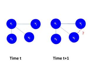
The link prediction problem asks, "Given a snapshot of a network at time t, can we predict new links which will occur at time t+1?"

The link prediction problem asks, “Given a snapshot of a network at time t, can we predict new links which will occur at time t+1?”

In our work, we explore how topological similarity indices of a network can be combined with node specific data to develop a link prediction tool. Rather than pre-supposing that all similarity indices are of equal importance, we employ an evolutionary algorithm to evolve coefficients to be used in a linear combination of these similarity indices. Our approach has the advantage of being able to detect which similarity indices are more salient predictors and doesn’t require any knowledge of the type of network one may be working with.

To test our method, we begin by examining one of the largest social networks in existence, namely Twitter. Below, we visualize the network of reciprocal replies for users who interacted within a single week in late 2008.

Given information about interactions in a given week, we seek to predict links in a future week.

Given information about interactions in a given week, we seek to predict links in a future week.

Our evolved predictors exhibit a thousand fold improvement over random link prediction, and a substantial improvement over individual indices used in isolation. The predictor also suggests possible factors which may be driving the evolution of Twitter reciprocal reply networks during the timespan of this study.

Our predictor reveals which topological and/or user specific indices are most important in link detection for a given a network. For example, index B is most often the top ranking index detected by the predictor. Other indices which were ranked well were indices E and I. This type of output can be helpful in detecting the salient features which may be driving the network's evolution over time.

Our predictor reveals which topological or user specific indices are most important in link detection for a given a network. For example, index B is most often the top ranking index detected by the predictor, while indices E and I are also important. This type of output can be helpful in detecting the salient features which may be driving the network’s evolution over time.

Returning to our original question, we ask: Given a snapshot of a Twitter reciprocal reply network, is it possible to predict the links which will occur in the future?

One approach is to predict a link between all of the people in the network, but clearly this is not the approach we wish to take. For example, in the case of a modestly sized network (say N=30,000 nodes), the number of potential links is roughly half a million! If we’re trying to recommend books to a shopper or potential dates to a person using a dating service, we certainly would not want to suggest half a million people for potential dates. It would be nice if we could recommend 10 books (or dates) and have the majority of those suggested links be successful.

In the language of signal processing, we hope to have a true positive rate (e.g., the % of time you’re actually right about the links that you predict) that is greater than the false positive rate (e.g., the % of time you’ve issued a false alarm). This relationship can be captured by the Receiver Operating Curve (ROC) shown below.

The Receiver Operating Curve (ROC) compares the true positive rate (TPR) and the false positive rate (FPR). The ROC curve shown here depicts a classifier (our link predictor) for which TPR>FPR.

The Receiver Operating Curve (ROC) compares the true positive rate (TPR) and the false positive rate (FPR). The ROC curve shown here depicts a classifier (our link predictor) for which TPR>FPR.

The area under the curve (AUC) provides one way of measuring the relative success of one’s method. An AUC of .50 suggests that the true positive rate is equal to the false positive rate, while an AUC > 0.50 indicates that the true positive rate is greater than the false positive rate. As shown in the picture above, our AUC is well above 0.50, in fact it is approximately 0.72, which is good!

These results are exciting! We’ve put together a research paper in which we describe our analysis and algorithm in more detail (http://arxiv.org/abs/1304.6257). Although we focused on Twitter in this investigation, our methodology is general and may apply to link prediction in many other types of time varying networks, such as disease networks or crime. It could also improve the “friends you may know” feature offered by many social networking services.

Here is a short video summarizing our work on link prediction:

3 Comments

Filed under mathematics, networks, social phenomena

The Daily Unraveling of the Human Mind

Each morning we find ourselves in wide flung arms of drowsy possibilites. Cradled by the warm embrace of our beds, we begin our day, rebooted and rejuvenated. Having not eaten for a full eight hours, we can enjoy a guilt free breakfast, setting a blissful tone for the day.

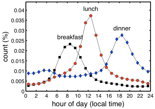
figtwitter_daily_anewfreq_spesh_thetruth001_noname

Hourly frequency of meal references on twitter.
See figure 1 page 3 of our paper for details.

Last night’s dreams of victory and triumph bolster our delusions of adequacy, preparing us to surmount any of life’s challenges. But the moment we step outside, reality commences its slow and insidious descent. Its weight, compressing our spine, crushing our dreams, alters the course of the day completely.  The soul crushing litany of work, interacting with people, and generally living our lives takes its toll. As our sanity unravels, apathy takes root. The profane becomes our standard of expression. In the throes of despair, we swear just to feel something. We swear increasingly as we realize the inevitability of repeating this all again tomorrow.

F***, that’s a terrifying thought.

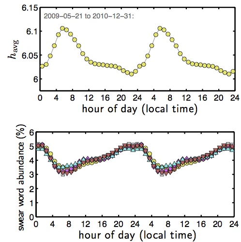
This ephemeral pattern is reflected in our tweets, our spontaneous burst of being. Below, we see our happiness peaks during the early hours of the day, and degrades as the hours progress (yellow circles). The proportion of profanity in our tweets, however, follows a reverse cycle. Profanity appears in a smaller percent of tweets at the start of each day, and increases gradually as time wears on.

Daily Unraveling

Daily Unraveling
See figure 10 page 15 of our paper for details.

Remarkably, the relative frequency of these five expressions of frustration (a******,  b****, s***, f***, m***********) are quite similar.

Well done, humans.

To avoid experiencing the daily unraveling, we recommend eating organic, local dark chocolate all day long.

3 Comments

Filed under mathematics, psychology, social phenomena

What’s the Most Important Theorem?

Mathematical truths are organized in an incredibly structured manner. We start with the basic properties of the natural numbers, called axioms, and slowly, painfully work our way up, reaching the real numbers, the joys of calculus, and far, far beyond. To prove new theorems, we make use of old theorems, creating a network of interconnected results—a mathematical house of cards.

So what’s the big picture view of this web of theorems? Here, we take a first look at a part of the `Theorem Network’, and uncover surprising facts about the ones that are important.  This is blatantly fun for us. Really.

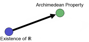
Let’s go through an example starting with the real numbers.  Mathematicians like to write these numbers as \mathbb{R}, and here we’ll start by bravely assuming that they exist. One result that follows from the existence of \mathbb{R}: Given a real number a belonging to \mathbb{R}, we can find a natural number n (e.g. 1, 2, 3 …) such that n>a. This is known as the Archimedean property.  To visualize this relationship, we draw an arrow from the existence of \mathbb{R} to the Archimedean property:

example_labels0_medium

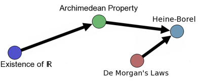
Now, the fact that real numbers satisfy the Archimedean property tells us something about sets that contain them. For example, more than a century ago, two guys named Heine and Borel used the Archimedean property to help prove their glorious, eponymous theorem.  We’ll now add an arrow leading from the Archimedean Property to the Heine Borel theorem, and we’ll include the one other component Heine and Borel needed:

example_labels1_DeMorgan_medium_Heine

All right: who is this De Morgan and what are his laws?  Back in the mid 1800’s, Augustus De Morgan dropped this bit of logical wizardry on the masses: “the negation of a conjunction is the disjunction of the negation.” We know, really exciting words.  If it’s not true that both A and B are true, then this is the same as saying either A or B or both are not true.  Better?

Before diving into a larger network, let’s think some more about these links.  One could prove the Fundamental Theorem of Calculus (which sounds important but could be just good branding) with nothing more than the axioms of ZFC set theory. But such a proof would be so long and tedious that any hope of conveying a clear understanding  would be lost.  Imagine taking all the atoms that make up a duck and trying to stick them together to create a duck; this would be the worst Lego kit ever.  And so in any mathematical analysis textbook, the theorems contain small stories of logic that are meaningful to mathematicians, and theorems that are connected are neither too close or too far apart.

For this post, what we’ve done is to take all of the theorems contained in the third edition of Walter Rudin’s Principles of Mathematical Analysis, and displayed them as nodes in a network. As for our simple networks above, directed edges are drawn from Theorem A to Theorem B if the proof of B relied on A explicitly. Here’s the full network:

ChapColorNoSinglesTOsize_Labels_less_more_arrows_bigger

Node size weighted by total incoming degree, colored by chapter, and laid out by Gephi’s Force Atlas.

We find that Lebesgue theory (capstoned by Lebesgue Dominated Convergence) lives on the fringe, not nearly as tied up with the properties of the real numbers as the Riemann-Stieltjes integral or the integration of differential forms. Visually, it appears that the integration of differential forms and functions of several variables rely the most on prior results. Over on the right, we’ve got things going on with sequences and series, where the well-known Cauchy Convergence criterion is labeled. By sizing the nodes proportional to their outgoing degree (i.e., the number of theorems they lead to), we observe that the basic properties of \mathbb{R}, of sets, and of topology (purple) lie at the core.

By considering the difference between outgoing and incoming degrees, we can find the most fundamental result (highest differential in outgoing and incoming degree, or net outgoing degree), and the most important or “end of the road” result (highest differential in incoming and outgoing degrees, or net incoming degree).  In Rudin’s text, the most fundamental result is De Morgan’s Laws, and the most important result is Multivariate Change of Variables in Integration Theorem (MCVIT, that’s a mouthful).

So the Fundamental Theorem of Calculus falls short of the mark with a net incoming degree 19, not even half of MCVIT’s net incoming degree of 45. And it is not the axioms of the real numbers that are the most fundamental, with the Existence of \mathbb{R} having a net outgoing degree of 94, but instead the properties of sets shown by De Morgan with a whopping net outgoing degree of 122. Larry Page’s PageRank (the original algorithm behind Google) and Jon Kleinberg’s HITS algorithm also both rate the MCVIT as the most important result.

Would you agree that MCVIT is the most “important” result in Rudin’s text? It could just be the most technical.  We have only used a few lenses through which one might choose to evaluate the importance of theorems, so let us know what you think, or give it a try. Here’s a link to the Gephi files, containing all of the data used here.

Lastly, the network itself can be built differently by changing which theorems are included, or which are used in proofs. The resulting structures combine historical development with the author’s understanding. The goal of new textbooks is, in part, to organize the results in the most understandable fashion. With this view, we can start to think of the Theorem Network as the natural structuring of complex mathematical ideas for the human mind.

Now, one might idly think of extending this analysis to all of human knowledge. In that direction, Griff over at Griff’s Graphs has been making some very nice pictures leveraging the work of all those who edit Wikipedia.

10 Comments

Filed under mathematics, networks